Think for a moment about the logos or brand marks to which you have the strongest connections. It’s likely that those attachments have grown over time. Your experiences with the product or service have shaped and colored your interpretation of the logo—a visual symbol of that brand. In this way, the logo serves as a receptacle for the meanings and memories that you’ve given it over time. The logo functions as a visual cue for recollections of these experiences, whether good or bad.
Too often, it seems, companies release new logos with triumphant declarations of their meaning, telling us what the logo stands for. In my experiences, both as a logo designer and as a consumer, I find that the strongest, most-enduring logos are those that convey a bit of symbolism of their own, suggestive of the brand’s characteristics and/or goals, but are simple enough so as to leave plenty of room for storing the interpretations and bonds that consumers will provide over time.
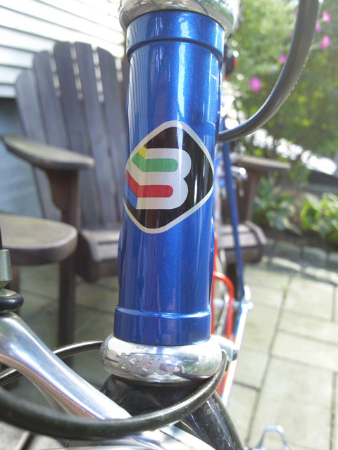
For me, a case in point is the logo for Basso, an Italian bicycle manufacturer. Shown here on the front of my 1996(?) Basso Gap, the logo is a stylized “B” that could also be read as a “3”, since the company was started in 1977 by the three Basso brothers in Vicenza, Italy. The colors streaming from the left side of the B are suggestive of jersey traditionally worn by bike racing’s world champion each year.
However, when I first acquired this bike several years ago, even though I was aware of these intended meanings, they meant little to me. Only after I began to enjoy some long rides on this bike did I truly begin to appreciate the fine craftsmanship that went into building this machine. Now, years later, seeing the logo brings back memories of countless great rides on this bike, some filled with heart-pounding adventures at high speeds, and some filled with lazy pedal strokes during relaxed, contemplative drifting along quiet country roads. Also, being one of three brothers, I’ve sometimes thought of my own brothers when I look down at the bike and see the B/3 symbol, briefly recalling our childhood experiences together and the paths our lives have taken in the years since.
The Basso logo didn’t provide any of this meaning. I did. The logo simply houses the significance that I give it. As a result, my attachment to it is uniquely my own and constantly evolving, and is therefore stronger.