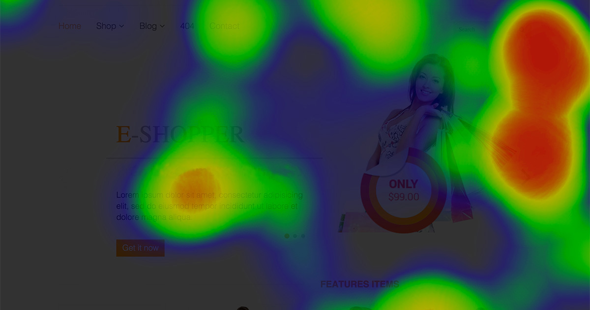
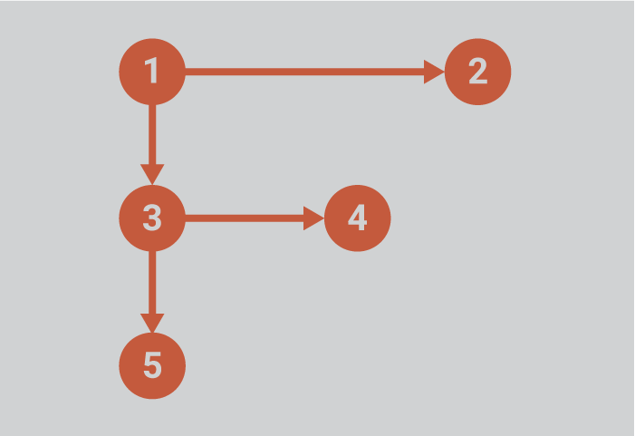
If you’ve got a website, the chances are good that your users are merely scanning your site’s content for highlights. Like it or not, it’s simply the way most people read (or don’t read) on the web these days. And according to the landmark study by Neilsen Norman Group in 2006, most desktop users are reading your site’s pages in an F-shaped pattern.
The NNG study not only introduced the F-shaped reading pattern, but was also one of the first to use eye-tracking technology and heat maps for displaying the resulting data.
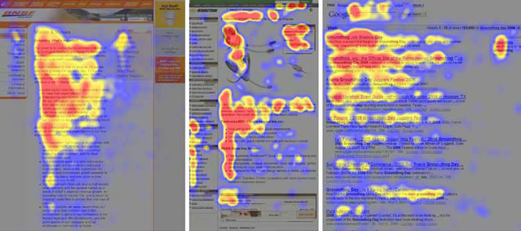
In the twelve years since its release, it has become one of the most cited studies in the field of UX. And unfortunately, one of the most misinterpreted and/or misapplied studies.
A possibility, not a rule
Over the last dozen years, much has changed on the web, and in the way the web is being used. These changes are pervasive and wide-ranging—from the devices on which the web is consumed to content design trends, advertising methods, and of course, changes in users’ attention spans.
While the F-Pattern is still relevant and still holds up in many cases, it has a tendency to be over-applied, or applied in cases where it shouldn’t be. As it turns out, it’s not the only pattern we follow.
Other common scanning patterns include:
The Gutenberg Diagram Pattern
The Gutenberg Diagram is used to show a user behavior known as reading gravity, the western habit of reading left-to-right, top-to-bottom. It describes a general pattern the eyes move through when looking at evenly distributed, homogeneous information. As a result, this pattern most often applies to text-heavy content.
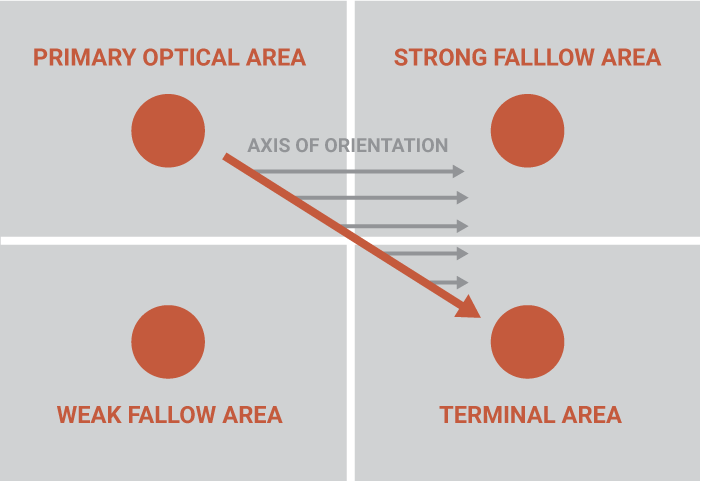
It divides the layout into 4 quadrants:
1. Primary optical area (top/left)
2. Strong fallow area (top/right)
3. Weak fallow area (bottom/left)
4. Terminal area (bottom/right)
In the context of print applications, this is sometimes referred to as the Cosmo Principle, and is often put to good use in poster design, particularly scientific posters.
The Z-shaped Pattern
As the name suggests, the Z-sphaped Pattern follows the shape of the letter Z. Readers will start in the top/left, move horizontally to the top/right and then diagonally to the bottom/right before finishing with another horizontal movement to the bottom/right.
This pattern is sometimes described as a Reverse S Pattern, suggesting more of a curved eye path, as opposed to the hard angled path.
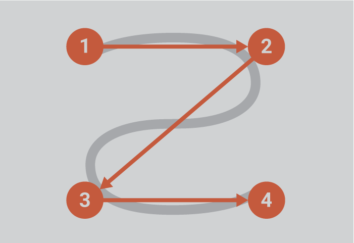
The main difference with the Gutenberg diagram is that the Z-shaped pattern suggests viewers will pass through the two so-called fallow areas. Otherwise, they still start and end in the same places and still pass through the middle.
Other Common Patterns
Other reading patterns commonly observed on the web today include:
- Layer-cake pattern occurs when the eyes scan headings and subheadings and skip the normal text below. A gaze plot or heat map of this behavior will show horizontal lines, reminiscent of a cake with alternating layers of cake and frosting.
- Spotted pattern consists of skipping big chunks of text and scanning as if looking for something specific, such as a link, digits, a particular word or a set of words with a distinctive shape or format (such as an address or signature).
- Marking pattern involves keeping the eyes focused in one place as the mouse scrolls or finger swipes the page, like a dancer fixates on an object to keep balance as she twirls. Marking happens more on mobile than on desktop.
- Bypassing pattern occurs when people deliberately skip the first words of the line when multiple lines of text in a list start all with the same word(s).
- Commitment pattern consists of fixating on almost everything on the page. If people are highly motivated and interested in content, they will read all the text in a paragraph or even an entire page. (Don’t count on this to happen frequently, though. Assume that most users will be scanning.)
[source]
Why People Scan in F-shaped Pattern
In instances when users do scan in an F-shaped pattern, NNG finds that it’s most often because all the following 3 conditions are present:
- A page or a section of a page includes text that has little or no formatting for the web. For example, it has a “wall of text” but no bolding, bullets, or subheadings.
- The user is trying to be most efficient on that page.
- The user is not so committed or interested that he/she is willing to read every word.
It’s important to keep in mind that the last two conditions describe the mindset of most web site users, who merely want to glean the desired information, complete the task at hand, and move on. So, that leaves us with condition #1 —a page with inadequate formatting. The good news is, that’s also the condition that you have control over. It’s up to you to format your content in a way that clearly conveys a hierarchy of information.
Preventing the F-shaped Pattern
It should come as no surprise that the F-shaped pattern is bad for your users and bad for your mission. When people scan in an F-shape, they miss big chunks of content, largely just because of how text typically flows in a column. Those skipped phrases and words are often important , sometimes more so than the words that are read. And more often than not, users won’t realize they’ve missed important content, since they don’t know what they didn’t see.
Simple tips to help avoid the F-shaped pattern and its consequences
- Include the most important points in the first two paragraphs on the page.
- Use headings and subheadings. Make sure they are more prominent than normal text so users can distinguish them quickly.
- Start headings and subheadings with the words providing the most information. If users see only the first 2 or 3 words, they should still get the gist of what follows.
- Group small amounts of related content and within visual boundaries, for example, by surrounding them with a border or using a different background.
- Bold important words and phrases.
- Utilize different formatting of links, and ensure that links include information-bearing words, instead of meaningless link text like “click here”. (Sidenote: This practice also improves accessibility for users who hear links read aloud instead of scanning the content visually.)
- Use bulleted and/or numbered list to call out items in a series or process.
- Eliminate unnecessary content. Always a good idea!

