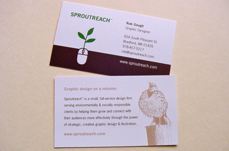
Putting the back of your business card to work for you
Among those of us whose work includes designing business cards, there is often some debate about the most effective treatment for the back of a card. Many prefer to leave the back blank, or at least leave significant white space – to allow for making personal notations, adding cell numbers on occasion, etc., in which case printing on uncoated stock is also very helpful in in avoiding smeared writing. Others prefer to use the back of the card in some other way, including product or service descriptions, or perhaps an eye-catching design to help the card stand out.
Like most other areas of design, the best decision is really dependent on the specific needs of the client, the means of distribution (i.e. the client’s patterns and habits when handing out their business card), and the specifics of their intended audience.

When re-printing the latest batch of my own business cards (pictured above), I chose to include my mission statement on the back, along with a small illustration. In addition to serving as a sample of my work, the illustration is a nod to my background as an environmental educator whose work included leading birdwatching expeditions. Perhaps it also serves as a loose metaphor for the spirit behind my current work.


Just passing by.Btw, you website have great content!
______________________________
Don’t pay for your electricity any longer…
Instead, the power company will pay YOU!
I’d just like to say that your business looks wonderful. I love what you did to the back of it. It’s as substantial as it is pretty. The illustration certainly was a nice touch.