There is no question that colors can play a big role in our emotional feelings towards a subject. Indeed, when used correctly, it ranks among the designer’s most powerful tools. When designing marketing materials, or even decorating an office, it is important to consider the psychological impact that color may have on potential clients. For example, if you want your audience to think of Spring, freshness and rebirth, you might choose a light shade of green.
Changing colors, changing emotions
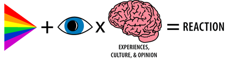
However, as with all things subjective, one must keep in mind that the same color might evoke completely different emotions across an audience. It depends on the individual, their past experiences and the frame of reference those experiences collectively create. To some, the color blue may give rise to calm, peaceful thoughts. The identical color may make someone else feel very melancholy. Furthermore, simply changing the shade of a particular color can drastically change the emotion that the color evokes. For example, if dark red evokes anger or a feeling of danger, by lightening the shade of red the feelings could change to love or strength.
Avoid color-in-mouth disease
Also noteworthy is the often striking differences in how colors are perceived across cultures and geographic regions. It is prudent of any designer to become aware of these nuances, at the very least so as to avoid a costly marketing blunder. Color Voodoo’s e-book Global Color: Clues & Taboos provides some useful insight into many of these differences, many of which are deeply rooted in societal traditions. For example, the book points out that in Japan red is generally associated with happiness, marriage and prosperity. However, the use of red ink (for type) is often associated with a traditional method of writing a letter intended to end a relationship (think “Dear John” or employees’ “pink slip”).
The bottom line
Our best advice when designing something is to keep color theory in mind, but remember that it is not an exact science. Research color theory to acquire an understanding of its patterns and applications, then use it as a tool, rather than a guiding force in your design. More importantly, if the color palette you have chosen makes you feel the way that you are hoping your potential audience will feel, then go with it.
Good Article
Keep up the good work
really impressed