Water Striders

ir_070509

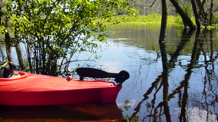
With some beautiful weather this past weekend, a welcome respite from the recent rainy pattern, Lisa and I spent an afternoon kayaking the meandering Ipswich River. As you can see from the photo above, water levels were quite high. This bodes well for the health of the river this summer, as its history of low-flow issues have given it the dubious distinction of being among the “10 Most Endangered Rivers in America“.

Also evident in the picture above are the wonderful shadows, reflections, and patterns cast across the river on a sun-filled afternoon. At the time this particular photo was taken, we were taking a break along the bank, enjoying the scenery and a snack. It was then, in the clear shallow water by the shoreline, that we noticed the wonderful shadows being cast by water skimmers as they moved across the surface. Strangely incongruous with the size and shape of the skimmers themselves, these shadows are far larger than the skimmers and include circular shadows created by the points where the skimmers legs are touching the water. (Explanation: The dark shadow for each of the water strider’s legs is an example of refraction, an optical effect resulting from the depression in the surface of the water caused by each leg.)

strider-shadows

I made this image (above) to help me remember a wonderful afternoon spent with Lisa, the Ipswich River, and its treasures.

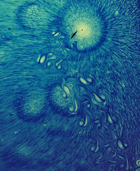
For more information about the science behind water striders and their locomotion, check out this cool Water Strider Study out of MIT’s Fluid Dynamics Lab . In addition to some great information, it includes some beautiful images, like the one below generated by the movement of striders across water dyed with Thymol Blue.
strider-thymolblue

Big Book of Self Promotion

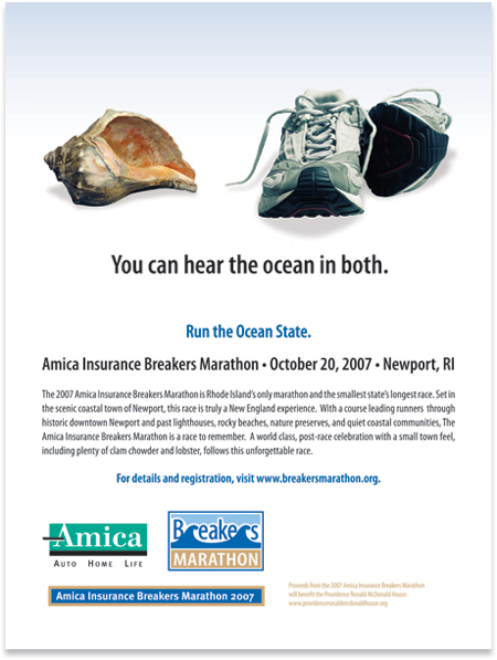
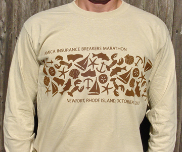
We’re pleased to share news that some of our work is included in the recently released Big Book of Self Promotion, (S. Stephens, 2009, HarperCollins Publishers). Despite it’s title, the book has hundreds of examples of work created for clients, including a chapter, titled “Its All About the Event”, devoted to materials created to promote events. That is where you’ll find the two pieces of ours in the book —a poster and a t-shirt (shown below). Both were created for the 2007 Amica Insurance Breakers Marathon, held in Newport, RI, a fundraiser event to benefit the Providence Ronald McDonald House.

Breakers 07 poster Breakers 07 shirt

Shirt design inspired by the traditional, Hibiscus-banded Hawaiian shirts, but with a New England twist.

A few simple things I’ve learned so far

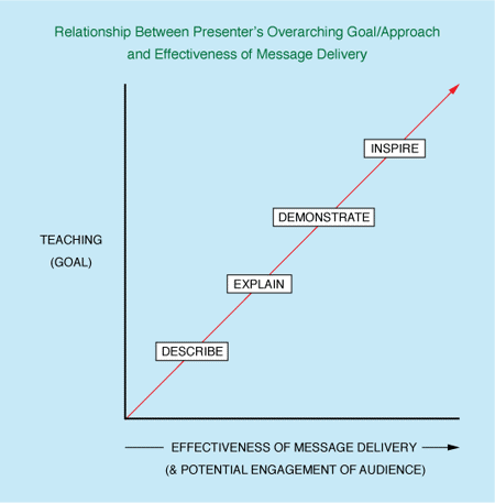
Soon after the start of my past career as an environmental educator, I learned the following about teaching, and the approach one takes to the practice.

graph-teaching-goals graph

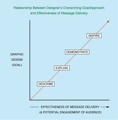
Nearly a dozen years later, at the start of my career as a graphic designer, I discovered that a similar principle holds true for graphic design.

Graphic Design goals graph

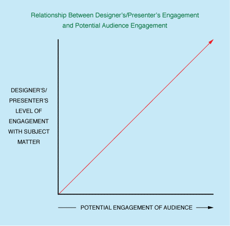
Around that same time, I came upon a bit of self-understanding regarding my work and the topics I was addressing. While the following surely doesn’t apply to all designers, I have found the principle is holds up in my case, and perhaps even grows stronger over time.

graph-engagement graph

Our new friend from Kenya

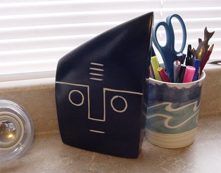
Lisa and I were strolling through a local store recently when a wonderfully peculiar item caught my eye. It was a 9″ inch high ebony carving, made in Kenya, with a simple face etched in one side. We talked briefly about how funny the facial expression was. Despite its simplicity, it seemed to be all at once happy, puzzled, and a bit concerned. We laughed that it reminded us of Wilson the Volleyball.

So you can imagine my delight to discover it sitting on my desk one morning. Apparently Lisa had returned several days later and purchased the carving as surprise gift.

wilson

“Wilson” has claimed his rightful place beside my computer, looking back at me…and occasionally fielding my questions with an appropriate look of dismay, as if to say, “You can’t be serious!”

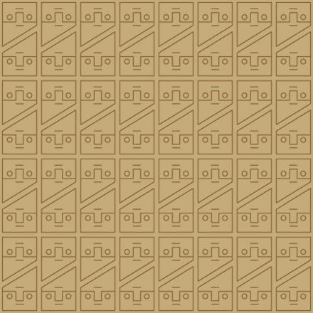
He also inspired the pattern/wallpaper shown here. If you can find some way to use it, please feel free. You can download a vector file of the pattern, and alter it however you wish.

wilsonpattern

What’s behind your business cards?

Putting the back of your business card to work for you

Among those of us whose work includes designing business cards, there is often some debate about the most effective treatment for the back of a card. Many prefer to leave the back blank, or at least leave significant white space – to allow for making personal notations, adding cell numbers on occasion, etc., in which case printing on uncoated stock is also very helpful in in avoiding smeared writing. Others prefer to use the back of the card in some other way, including product or service descriptions, or perhaps an eye-catching design to help the card stand out.

Like most other areas of design, the best decision is really dependent on the specific needs of the client, the means of distribution (i.e. the client’s patterns and habits when handing out their business card), and the specifics of their intended audience.

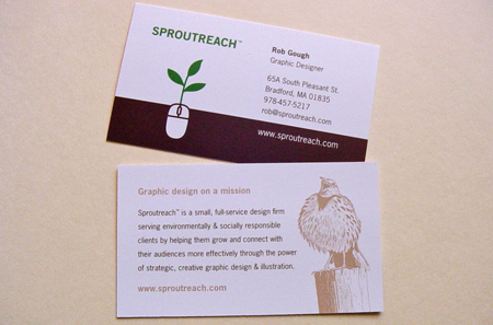
rgbizcard

When re-printing the latest batch of my own business cards (pictured above), I chose to include my mission statement on the back, along with a small illustration. In addition to serving as a sample of my work, the illustration is a nod to my background as an environmental educator whose work included leading birdwatching expeditions. Perhaps it also serves as a loose metaphor for the spirit behind my current work.