Audience-centered messaging

As mentioned here before, I’m a bike geek. I love everything about bicycles, from the simple, elegant designs to the high-tech, high-performance gear, from the relaxing hum of skinny tires on smooth pavement, to the whir of gears and heart-pounding excitement of racing. So when Bicycling Magazine released their “we know” campaign last spring — a print ad series promoting subscription on the basis that ‘they know cyclists’, I was a shrewd member of their audience. But they really nailed it. So much so, that I instantly ripped out the ads and saved them in a folder of my favorites.

weknow1.gifTo those not stricken with the obsessive disorder that cycling nuts (and their patient spouses… sorry Lisa) know too well, these ads may read a bit odd. But to the rest of us, those among us that that make a big deal over grams and millimeters, and as the ads suggests, clean our bikes with loving care and detail, these ads really hit home.

What appeals to me about these ads is their ability to cut through the materialistic, gotta-have-the-latest b.s., and get to the heart of what many of us love so much about bikes…the details. With some great imagery, and the simple sentence, “We know.” placed beneath the picture, these ads are a great example of strong, audience-centered messaging. Kudos to the folks at Rodale. You made me believe that your magazine does indeed understand my compulsion. You also made me want to clean my bike.

Words to live (and design) by

My father (Thomas J. Gough) was a psychologist by profession. Perhaps because of his quest to better understand and help people, and/or as a result of being the son of an award-winning commercial graphic artist, he had an acute sense of the power of words.

Consequently, my father chronicled much of his life’s discoveries, thoughts, and inspirations on little bits of colorful paper. These paper scraps, many of which were on Post-it Notes (after 1980), were stuck in books, his office, or carried about in his briefcase or wallet.

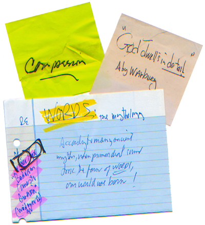
notesonwords.jpg

Above are a few of my favorites, with messages I find especially meaningful to my life and work.

1) A single word, compassion, scribbled on a well-traveled note, torn and repaired with scotch-taped

2) A quote from art-historian Aby Warburg, God dwells in detail

3) a note jotted down while listening to an audio tape from the library of Widener University, where my father taught in the ’80s, RE Words: the mythology…According to many ancient myths, when primordial sound took the form of words, our world was born!

Thanks Dad. I miss you.

Ogham: the ancient script of Ireland

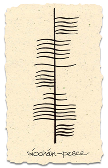
ogham_peace.jpgWith another St. Patrick’s Day upon us this weekend, it seems a fitting time to share my longstanding fascination with Ogham, an ancient form of writing dating back to 5th century Ireland.

Ancient Ogham inscriptions were carved in stone or wood, and read from bottom to top. It is sometimes referred to as the “tree alphabet”, since each of the twenty main letters in Ogham’s phonological alphabet is given the name of a tree. Each of these trees has a sacred meaning in the Celtic religion.

The exact origin of this form of writing is uncertain, but many believe it was inspired by Ogma, the “god of eloquence “. Some researchers believe that the symbols used in Ogham were adapted from a ritualistic sign language, with Ogham’s characteristic lines attached to a stemline being taken from the display of fingers from a hand.

For those interested in learning more, Wikipedia provides a comprehensive definition and history of this unique form of writing, including the descriptions shown here to the right. (mouseover the forms’ names)

In the handwritten example I’ve provided above, I took the liberty of mixing the “classical” vertical format of Ogham carved inscriptions with a “modern” script and a stylized treatment. However, much of the Ogham that appears on paper today is written in a horizontal, left-to-right format and uses simple straight lines.

If you want to try some experimenting of your own with Ogham, you can download some free Ogham fonts, courtesy of evertype.com.

Happy St. Patrick’s Day to all!

Author’s note: My Ogham example conveys a wish for lasting peace in Ireland this year. After far too much bloodshed, we are given hope by the recent news out of Ireland and the recent rise in the use of words instead of arms to resolve differences within the region. May this change continue, and may the rest of the world take note.

A funny thing happened to Web 2.0

Unless you have somehow managed to have very limited dealings with the web, whether as a user or a marketer, you have undoubtedly heard the term Web 2.0. Perhaps even to the point of disdain.

This term, coined by O’Reilly Media in 2004, began as a concept intended to describe the next generation of the web (now fully upon us), with an emphasis placed on collaboration and sharing (of resources and data) among users. For a through introduction, check out Tim O’Reilly’s definitive essay entitled What is Web 2.0. The concept includes a specific set of characteristics of Web 2.0 and has evolved to be at the very heart of the modern web.

Unfortunately, somewhere along the way the term became linked to several other things as well, not the least of which is a sort of “next-big-thing” marketing cliche, causing the term to often be inappropriately used to describe that which aims to be modern and fresh.

For better or worse, and perhaps as a side-effect of the abovementioned misuse, “Web 2.0” has also come to be used in describing a certain design aesthetic. This look, although poorly defined, has some recognizable characteristics. This typically includes bright colors, such as lime green and orange (perhaps the unofficial color of Web 2.0), and fonts that have a soft look or rounded corners. For a wonderful spread of logos created in this style, check out the terrific collection of Web 2.0 logos assembled by Stabilo Boss and posted on his Flickr site.

web20logos.jpg

While this aesthetic aspect may someday soon prove to be not much more than a design fad, the original idea behind Web 2.0 -as a platform for increased usability and greater open resources- is here to stay.

Displaying the lexicon of a nation

stateoftheunion_tn.gifWe recently came across Brad Borevitz’ State of the Union (SOTU), a remarkable web project that allows users to explore changes in use of the English language in the United States over the past 200 years, using the State of the Union as a window. As the site’s author puts it, “SOTU allows you to explore how specific words gain and lose prominence over time, and to link to information on the historical context for their use”. The project synthesizes a great deal of data (in this case, every word uttered in over 200 years of State of the Union addresses) and displays it in a visual format that is easy to digest and easy to navigate. Through the manner in which the author has graphed each speech, he has enabled users to grab information at a glance about the relative abundance and frequency of specific words in specific speeches.

We took a quick tour through the decades and were immediately struck by the differences in word usage across different eras in our nation’s history and how the words shed light on the priorities and concerns of our nation at that time, or at least those of the presidential administration. This connection is further highlighted by a one-click feature in each graph that reveals a timeline in the sidebar describing events that happened in and around the year of that particular address

Aside from its value as a tool for both historical evaluation and linguistic study, this project is also a testament to the power (existing and potential) of open resources across the web, including the very software used write the interface. To that point, here is a statement taken from the site’s “About” page, where such sources are credited:

State of the Union was authored by Brad Borevitz using Java for the analysis and Processing for the graphic user interface. A project such as this, although executed directly by a single person, is a collaborative effort. The work would not be possible without the kind of open resources that are currently available on the web. It required a good deal of research on hundreds of websites to build the knowledge-base that produced this project.

I have relied directly on the following resources to implement the code:

  • The interface is written using Processing.
  • The search engine is Sphider.
  • Timelines are from Wikipedia.
  • Most of the text was from Project Guttenberg.
  • JavaScript for highlighting is based on code from Kryogenix.
  • JavaScript for switching style sheets is from A List Apart.
  • Methods for building frequency word lists were based on code in Andrew Roberts’ aConCorde.
  • The syllable counting algorithm is by Daniel Schiffman.
  • Thanks to Christiane Paul & Martin Wattenberg for feedback on the new version.