Unless you have somehow managed to have very limited dealings with the web, whether as a user or a marketer, you have undoubtedly heard the term Web 2.0. Perhaps even to the point of disdain.
This term, coined by O’Reilly Media in 2004, began as a concept intended to describe the next generation of the web (now fully upon us), with an emphasis placed on collaboration and sharing (of resources and data) among users. For a through introduction, check out Tim O’Reilly’s definitive essay entitled What is Web 2.0. The concept includes a specific set of characteristics of Web 2.0 and has evolved to be at the very heart of the modern web.
Unfortunately, somewhere along the way the term became linked to several other things as well, not the least of which is a sort of “next-big-thing” marketing cliche, causing the term to often be inappropriately used to describe that which aims to be modern and fresh.
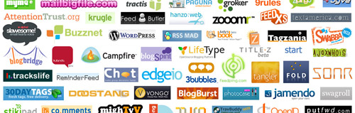
For better or worse, and perhaps as a side-effect of the abovementioned misuse, “Web 2.0” has also come to be used in describing a certain design aesthetic. This look, although poorly defined, has some recognizable characteristics. This typically includes bright colors, such as lime green and orange (perhaps the unofficial color of Web 2.0), and fonts that have a soft look or rounded corners. For a wonderful spread of logos created in this style, check out the terrific collection of Web 2.0 logos assembled by Stabilo Boss and posted on his Flickr site.
While this aesthetic aspect may someday soon prove to be not much more than a design fad, the original idea behind Web 2.0 -as a platform for increased usability and greater open resources- is here to stay.
Thanks for the link to the logos. Todays websites have proven the web2.0 concept. Although I don’t like the term web2.0, I’d rather say user generated content, has changed the way we use internet.