Unifying content and presentation with type

Inspired by Teal Triggs’ book Type Design: Radical Innovations and Experimentation, I decided to explore the use of calligrams. By definition, a calligram is formed when a group of words are arranged to visually represent its content. Calligrams are considered to be a form of concrete poetry, also called visual poetry.

ofobc_draft.jpg

The images created by these visual forms provide a unique means of integrating content and visual display -indeed the goal of any graphic designer.

In this most recent case, I explored the technique as a means of conveying an advertising message for a client in Rhode Island that creates custom foot orthotics using a new technology. The resulting calligram was to be used on the back side of a business card, providing an eye-catching means of delivering a message.

The (r)evolution of logos

What is a logo?

Most broadly put, a logo is a design that symbolizes one’s organization or project. A more pedantic view reveals that the word “logo” is a clipped form of the term logotype, meaning a single type body or design containing a short, often-used set of letters or a distinctive company mark or signature.

In modern society, the terms logo, logotype, mark, icon and brand are often tossed around interchangeably within the business sector. Students and practitioners of marketing and design will surely insist, and rightly so, on the nuances that differentiate these terms and their proper usage. We can discuss such distinctions at another time. For now, let us concentrate on the larger picture. The evolving, expanding role of logos -be they words, pictures, or a combination of both- in modern culture.

A look back across time
floweroflife.jpg

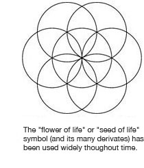
Perhaps the earliest uses of symbols to communicate words and ideas was by ancient Babylonian, Mayan, Chinese, Egyptian cultures. Their prolific use of symbols and pictographs to communicate words and ideas is considered by some to mark the birth of early logos.

Further along the timeline of human civilization, we see several popular religions begin to use a select set of consistent symbolism to deliver and reinforce their message to followers. The cross and the Star of David are among the many examples of these symbols, rich with tradition and power.

In the 13th Century, in the early days of the Renaissance, we began to see additional uses of symbols. Family crests were used on personal possessions of all types and sizes. The ubiquitous use of such symbols, particularly on flags, may well have been a pivotal point in history for logos, as people began to see the values and differences in such designs. For example, what would make one flag more recognizable than another across a large crowded landscape of a Renaissance period craft fair? Perhaps such questions and the resulting critical observations of such differences in color, pattern, and layout provided important insights for some of the earliest designers.

Within the same age and the periods that followed soon after, the use of symbols by patternmakers, metalsmiths, paper makers, ranchers and other merchants began to bring about a societal recognition of the value of a mark. One could recognize the work or product of a particular merchant by their seal, watermark or brand. Undoubtedly, as these merchants began to get additional work by those who recognized their mark on work that fit their needs or taste, brand marketing was born.

Flash forward

In today’s society, of course we conduct business in a vastly more crowded and complicated marketplace, not to mention one that has been made global by the advent of the internet. As a result, one’s logo or trademark must speak more clearly about it’s bearer, and do so with increased originality and memorability. This rich, global market requires that today’s designer’s conduct more thorough research into the potential originality of any concepts, so as to avoid any potential infringement issues.

These issues certainly present some additional challenges for modern logo designers. However, as with so many other thing in life, it is exactly these challenges and the creative, unique thinking that goes into overcoming them, that gives rise to great logos.

The bottom line

Call them what you will – icon, trademark or logo – these powerful symbols have played an important role in the development of modern society and have since revolutionized the advertising world.

What’s in the cards for your business?

Even in today’s digital world, with electronic networking holding increasingly larger importance with each new technological advancement, business cards are far from dead. In fact, it is hard to imagine anything will ever take the place of a physical card that you can hand to someone at a meeting or just in passing. Your business card is a tangible reminder of you and your services. It can be tucked in a pocket or briefcase, tacked to a bulletin board, or just bounced around in the recipient’s car or office, only to re-surface just when they need that new product you told them about when you last met.

More than just your contact information on a piece of paper, business cards are an opportunity to make a statement about who you are and what your business is all about. Daring & bold or conservative & subdued, modern & edgy or classic & refined, it all depends on the nature of your message and how you want to deliver that message to your customers. From the colors, fonts and layout to the type of paper and finish, the options are endless.

bizcardsamples.jpg

Through it all though, we’ve identified some helpful guidelines. Here’s a few:

1. A business card can be held vertically or horizontally. Think about your desired look, required content and the best use of space.

2. Maintaining a consistent “look and feel” throughout the materials in your business’ identity package (business cards, letterhead, envelopes, etc.) will help build brand presence and recognition. This includes proper use of company colors, fonts, and other specific style guidelines.

3. If you choose to use both sides of your card, one side should always include the company logo, your name and contact information. The other side can include a list of your services, a map to your company’s location, a brief description or image of your product, etc.

4. Keep it clean and simple! You don’t need to tell everything about your company on your business card. Too much information can be overwhelming to potential clients. Make sure to include the logo (company identity), your name, phone number(s), email and address. Your contact information is vital, so make sure it is highly visible. Don’t let images outweigh your contact information.

5. Think about the image you wish to portray. A business card can be professional, humorous, flashy, geared towards a particular age or gender, etc.

6. Keep font types to a minimum. Use text placement, font size and style to dictate the hierarchy of information.

Whatever direction you (and your designer) choose to go with your business card, at the forefront should be notion that it will represent you and your company — no small feat for a 3.5 inch piece of paper. It needs to be memorable and clearly announce who you are, what you do and how to contact you. You and your card should be remembered for all of the “right” reasons.

gdexchangecards.gif

PHOTO: A collection of business cards obtained via a mail exchange program among participants over at the About.com Graphic Design Forum this past summer. In most cases the designers’ own cards, they reflect a wide variety of styles and specialties within the graphic design profession.