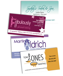
Even in today’s digital world, with electronic networking holding increasingly larger importance with each new technological advancement, business cards are far from dead. In fact, it is hard to imagine anything will ever take the place of a physical card that you can hand to someone at a meeting or just in passing. Your business card is a tangible reminder of you and your services. It can be tucked in a pocket or briefcase, tacked to a bulletin board, or just bounced around in the recipient’s car or office, only to re-surface just when they need that new product you told them about when you last met.
More than just your contact information on a piece of paper, business cards are an opportunity to make a statement about who you are and what your business is all about. Daring & bold or conservative & subdued, modern & edgy or classic & refined, it all depends on the nature of your message and how you want to deliver that message to your customers. From the colors, fonts and layout to the type of paper and finish, the options are endless.

Through it all though, we’ve identified some helpful guidelines. Here’s a few:
1. A business card can be held vertically or horizontally. Think about your desired look, required content and the best use of space.
2. Maintaining a consistent “look and feel” throughout the materials in your business’ identity package (business cards, letterhead, envelopes, etc.) will help build brand presence and recognition. This includes proper use of company colors, fonts, and other specific style guidelines.
3. If you choose to use both sides of your card, one side should always include the company logo, your name and contact information. The other side can include a list of your services, a map to your company’s location, a brief description or image of your product, etc.
4. Keep it clean and simple! You don’t need to tell everything about your company on your business card. Too much information can be overwhelming to potential clients. Make sure to include the logo (company identity), your name, phone number(s), email and address. Your contact information is vital, so make sure it is highly visible. Don’t let images outweigh your contact information.
5. Think about the image you wish to portray. A business card can be professional, humorous, flashy, geared towards a particular age or gender, etc.
6. Keep font types to a minimum. Use text placement, font size and style to dictate the hierarchy of information.
Whatever direction you (and your designer) choose to go with your business card, at the forefront should be notion that it will represent you and your company — no small feat for a 3.5 inch piece of paper. It needs to be memorable and clearly announce who you are, what you do and how to contact you. You and your card should be remembered for all of the “right” reasons.

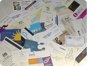
PHOTO: A collection of business cards obtained via a mail exchange program among participants over at the About.com Graphic Design Forum this past summer. In most cases the designers’ own cards, they reflect a wide variety of styles and specialties within the graphic design profession.

