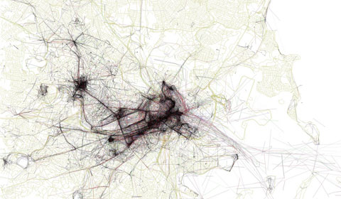
It’s often said that every major city has a heartbeart, with a unique pulse all its own. That metaphor is made by visible by the wonderful maps produced by photographer Eric Fischer as part of his Geotaggers’ World Atlas – a data visualization project in which he plotted Flickr photos on a map, highlighting 50 major cities worldwide.

Shown above is a portion of Fischer’s map of Boston. The different colors represent different modes of transportation: Black is walking (less than 7mph), Red is bicycling or equivalent speed (less than 19mph), Blue is motor vehicles on normal roads (less 43mph); Green is freeways or rapid transit (43+ mph). More black and red, please!
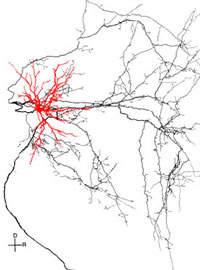
Immediately upon encountering these maps on the Flickr Blog, I was reminded of visual representations I’ve seen of dendrites – the branched projections of neurons that conduct electrochemical stimulation within our cells. The image shown below is from the University of Wisconsin – Madison Department of Physiology’s Binaural Physiology Lab. It shows the onset response revealed through intracellular labeling as part of the lab’s anatomical studies of brain cells. The “dendritic tree” is shown in red, along with a system of axons is shown in black.


