Hey, you’re sitting on my ad

I grew up in southern New Jersey. Not that it has anything to do with “growing up”, but as a young adult I also spent seven summers there working as a lifeguard on the beaches of Cape May, NJ. Trust me when I tell you that the experience provided me with the opportunity to observe all kinds of human behavior. Did I mention it was New Jersey? So you can imagine my interest when I learned of NJ-based Beach ‘N Billboard, an advertising company that partners with local municipalities to imprint their customers ads in the sand.

beachad1.jpg
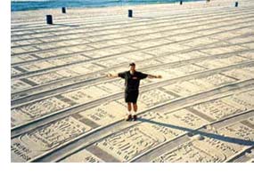
Here’s how it works. Coastal cities and towns clean the beaches at night using a tractor-like vehicle that pulls behind it a mechanical rake that sifts through the sand, picking up items as small as a cigarette butts (and scaring off would-be romantic interludes). These machines typically leave a smooth blank canvas of sand in their wake. Enter the folks at B ‘N B. Once a contract has been made with the city/town, these machines are fitted with “odometer-equipped, patented Beach ‘N Billboard impression devices, which impress approximately 5,000 of your 12′ x 4’ ads in the sand each day.” The following morning, early-rising beach patrons arriving with the hopes of securing the perfect spot for their towel and chairs are met with a seemingly endless pattern of ads spread across the beach. Needless to say, these imprinted ads are quickly trampled by beach-goers as the morning progresses.

I must admit I’m not entirely sure what to make of this. On one hand, this ad method clearly has some environmental appeal. Not only does it present a paperless alternative for advertisers, and a direct link to cleaner beaches, but it also includes the nice addition of the note “Please Don’t Litter” at the bottom of each ad. However, there is something about it that I find a bit irritating. Not that the beaches of NJ have ever been a sanctuary from advertisements, with the stream of banner-dragging planes buzzing over head, the sing-song melody of the ice-cream trucks driving along the adjacent boulevard, and a kaleidoscope of umbrellas emblazoned with Coca-Cola, Budweiser and who-knows-what-else up and down the beach. Nonetheless, I find this unsettling. Perhaps it is the fact that these ads are imprinted directly (albeit temporarily) onto the natural resource itself, as if to say” this day at the beach brought to you by…”.

Then again, in an era where almost everything seems to be viewed as potential ad space, maybe this was inevitable. The tide, if you will.

Sustainable graphic design (an intro)

Creative professionals, like all business professionals, have a responsibility to conduct their work in a manner that is mindful of the communities in which they operate and of the world as a whole. A big part of such conduct centers around the concept of sustainability, or taking into account the economic, social, and environmental health needs of a community (and/or the world) and making decisions accordingly.greendesign.gif

In the case of designers, sustainable graphic design is a systemic approach that involves much the same mindset as other areas of sustainable design, such as minimizing the depletion of non-renewable resources. However, it also requires some additional considerations specific to the design industry. Although far from a complete list, below are some of these considerations.

10 BEST PRACTICES FOR SUSTAINABLE GRAPHIC DESIGN:

  1. Begin by examining the potential impacts of the project and how they can be lessened.
  2. Ask yourself if printed material is required to accomplish your objective (or would could the same goal be achieved electronically via email or web).
  3. Look for ways to maximize longevity/re-use of any materials produced? (ex: Could you extend the material’s lifespan by omitting dates?).
  4. Choose recycled, nontoxic materials. (ex: recycled, chlorine-free paper, water-based vegetable inks, etc.) Sidenote: For a cool quantitative illustration of the benefits, check out Neenah Paper’s Environmental Savings Calculator.
  5. Choose local materials. (reduce shipping impact and aid local economy)
  6. Reduce waste. (ex: layout job to print on entire press sheet)
  7. Choose local vendors and/or vendors that use renewable energy.
  8. Avoid unnecessary ink coverage in your designs.
  9. Plan ahead for product delivery, maybe tying it in with other errands (ex: avoid high impact rush shipping).
  10. Foster sustainable design at the workplace (yours and other creative professionals’). Maintain a dialog with coworkers about the ways to reduce impacts of your projects.

Many corporations are beginning to see the benefits that environmental responsibility can have on their bottom line. A few are even realizing the benefits of what John Elkington, co-founder of the business consultancy SustainAbility, dubbed the triple bottom line, a win-win-win for People, Planet, and Profit. Some businesses are going as far in their commitment to social responsibility as to measure their success across all three of these areas. Unfortunately, for others the message is slower to sink in. As creative professionals, we have a unique opportunity (if not an obligation) to facilitate this change through the work that we do and the various companies that we work with.

Additional resources:

For graphic designers: renourish: nutrients for the graphic design community , including listing of environmentally safe(r), EPA -approved, Pantone Colors

For any small business: Greening Your Business: A Primer for Smaller Companies

The role of pen & pencil in modern graphic design

It seems that once again, a small but growing movement is occurring within the graphic design industry in which traditional illustration skills are being looked upon as being of unique importance. This is certainly not to say that computer skills are not of equal importance, as today’s advertising media require a successful designer to not only have them, but to maintain a high level of proficiency. Rather, the aforementioned movement (maybe too strong a word) looks upon the two as complementary, if not even symbiotic skills, and of equal value. Good news for those of us who stand with one foot on each side of this discipline divide.

Designer or and Illustrator

sketchpower2.jpg

Successful designers and Creative Directors have long been telling aspiring young designers to turn off their computers and get a firm handle on the basics first. Learn to draw, learn to think, learn to simply express a concept on paper and share it with others through dialog (see Don Moyer’s Napkin Sketches 101). Sage advise, without a doubt. But illustration, whether it be as a means to an end, or as a step in the process through which a concept is portrayed to clients or colleagues, holds far more value than a step in a designer’s training. Obviously, illustrators must routinely make design decisions, and graphic designers must illustrate at times. But in today’s industry, not only are the two disciplines regularly crossing paths, but many of today’s designers are striving to combine illustration into their design work in new (or old) ways, myself among them.

What goes around…

With the trend toward computer art nearly two decades old, the design industry is beginning to witness a resurgence of hand-done, non-computerized looking projects. Some designers are intentionally including “mistakes” in their computer-enhanced work to “take the polished edges off” or provide a more organic look –something well beyond the often over-used grunge look or various software filters/effects. It is difficult to tell what is fueling this emerging trend. Perhaps it is a response to the inevitable backlash as many designers grow frustrated with the compuscentric world in which we find ourselves spending far to much time. Or perhaps it is being driven by the ad industry, as some agencies seek new ways to tap into content-hungry audiences with messages that cut through the cliches and too-slick imagery.

The bottom line

Perhaps we are at last approaching the end of the debate between “illustrator” vs “designer”, getting beyond the preconception-laden labels. Graphic design is about problem solving and story telling —developing solutions to the challenges to delivering clear, concise messages to media-savvy consumers in cluttered, drive-through economy. The last thing any creative professional should be thinking about is these industry labels and their constraints, real or perceived. Rather, we should be using the tools available to us to create unique, effective solutions. We should be seeking opportunities to unleash our passions —passion for design, passion for dealing with our clients’ needs, or passion for learning more about the world through our work. This leaves little room for the baggage of labels.

Color theory

There is no question that colors can play a big role in our emotional feelings towards a subject. Indeed, when used correctly, it ranks among the designer’s most powerful tools. When designing marketing materials, or even decorating an office, it is important to consider the psychological impact that color may have on potential clients. For example, if you want your audience to think of Spring, freshness and rebirth, you might choose a light shade of green.

Color Theory diagram

Changing colors, changing emotions

However, as with all things subjective, one must keep in mind that the same color might evoke completely different emotions across an audience. It depends on the individual, their past experiences and the frame of reference those experiences collectively create. To some, the color blue may give rise to calm, peaceful thoughts. The identical color may make someone else feel very melancholy. Furthermore, simply changing the shade of a particular color can drastically change the emotion that the color evokes. For example, if dark red evokes anger or a feeling of danger, by lightening the shade of red the feelings could change to love or strength.

Avoid color-in-mouth disease

Also noteworthy is the often striking differences in how colors are perceived across cultures and geographic regions. It is prudent of any designer to become aware of these nuances, at the very least so as to avoid a costly marketing blunder. Color Voodoo’s e-book Global Color: Clues & Taboos provides some useful insight into many of these differences, many of which are deeply rooted in societal traditions. For example, the book points out that in Japan red is generally associated with happiness, marriage and prosperity. However, the use of red ink (for type) is often associated with a traditional method of writing a letter intended to end a relationship (think “Dear John” or employees’ “pink slip”).

The bottom line

Our best advice when designing something is to keep color theory in mind, but remember that it is not an exact science. Research color theory to acquire an understanding of its patterns and applications, then use it as a tool, rather than a guiding force in your design. More importantly, if the color palette you have chosen makes you feel the way that you are hoping your potential audience will feel, then go with it.

Word of mouth marketing

Word of mouth, and the concept of marketing it, is certainly not a new idea. Yet, in this age of instant communication, mass media, and more media paths than ever before, the simple concept holds as much power as ever, if not more. In fact, as new forms of communication arise, marketers are discovering new ways of harnessing its power.

wom_diagram1

Word of mouth, the simple act of consumers sharing information with other consumers, is perhaps the purest, most honest form of advertising in existence. At its core is people’s natural desire to share their experiences with others. Word of mouth cannot be faked or manipulated, and its purity should be respected and protected. The Word of Mouth Marketing Association’s (WOMMA) Code of Ethics provides a wonderful framework for preserving the integrity of word of mouth.

There are many things that businesses can do to build on positive word of mouth and make the most of it -the core goal of word of mouth marketing. Successful (and ethical) word of mouth marketing techniques are based on the principles of customer satisfaction, open & honest dialog, and transparent operations & communications.

WOMMA describes the basic elements as:

  • Educating people about your products and services
  • Identifying people most likely to share their opinions
  • Providing tools that make it easier to share information
  • Studying how, where, and when opinions are being shared
  • Listening and responding to supporters, detractors, and neutrals

Within these basic elements, WOMMA provides 8 strategies, all of which involve “finding ways to support satisfied customers and making it easier for them to talk with their friends.”

  1. Encouraging communications
  2. Giving people something to talk about
  3. Creating communities and connecting people
  4. Working with influential communities
  5. Creating evangelist or advocate programs
  6. Researching and listening to customer feedback
  7. Engaging in transparent conversation
  8. Co-creation and information sharing

These are not one-size-fits-all strategies. When considering incorporating any of these elements into your larger marketing plan, it is best to view them through the lens of your brand and your specific audience. What method fits the message and voice of your business/brand? What are the specific needs of your audience and how do its members talk to each other? Where there is overlap between the answers to these two questions, there lies the most potential for marketing word of mouth.