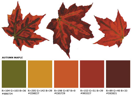
From pocket to palette in 4 simple steps
In my work as a designer, I often turn to nature in search of a little inspiration. Sometimes, when I’m really lucky, nature comes right to me with her ideas.
Such was the case this morning as Lisa and I shared our morning coffee on the deck. At my feet was a small assortment of leaves, having fallen a bit early this year as a result of below average rainfall. I grabbed a few that caught my eye and later performed the following simple steps to create a fall color palette:

-
Lay the selected leaves on a flatbed scanner and scan them into Photoshop (Illustrator would work equally well)
- Create a set of five containers (in this case squares) beneath the image
- Select 5 colors (using eyedropper tool) directly from the leaves that you feel go well together, filling each square with one color.
- Record the color values and gave the new palette a name you’ll easily remember later.
Enjoy!


The color palette you have created are so precise for autumn! I was looking for something similar to create a logo for a foodie event I may be having in my blog, and this is perfect – may I use it after citing your blog?
Certainly. Please feel free to use the palette however you wish. Best of luck with your project!
[…] Source […]