Images of numbers (and ourselves)

I’ve long been inspired by examples of effective use of visual imagery to represent quantitative information. It was this inspiration that initially drew me to Chris Jordan’s photography, but it is his ability to spark introspection through his images that makes them stay with me.

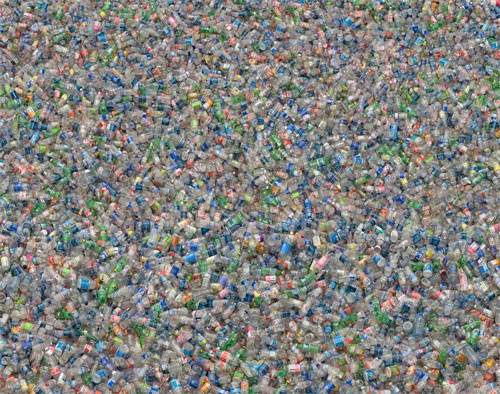
Jordan’s latest exhibit, “RUNNING THE NUMBERS: An American Self-Portrait“, is appearing this month at the Von Lintel Gallery in New York City. From the Von Lintel Gallery: “This series focuses on contemporary American culture through the unassailable lens of statistics. Each intricately detailed and astounding image, assembled from thousands of smaller photographs, portrays a specific quantity of a particular object.”

For me, aside from provoking thought regarding cultural practices that generate such numbers, these photographic works leave a lasting impression of the the enormity of the numbers they portray. As a “visual person”, the works also get past the often mind-boggling effect of such numbers when they appear in their standard numerical form, allowing me to grasp them a bit more.

Here is a sample piece:

plasticbottles_full.jpg

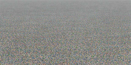
Above: Plastic Bottles, 2007 (60″ x 120″) 5′ x 10″. Depicts two million plastic beverage bottles, the number currently used in the U.S. every five minutes.

plasticbottles_partzoom.jpg

Above: Partial Zoom

plasticbottles_actual.jpg

Above: Detail at Actual Size

The B word: the misuse & overuse of “brand”

For some time now I have been growing increasingly turned off by the ubiquitous and ambiguous use of the term “brand”. As a result, I was delighted to stumble upon a recent entry in Russel Davies’ blog Advertising Practitioner, entitled Branding – the even more dismal science, in which he examines “how the idea of a brand has been so devalued by overuse, over-claim and over-thinking.”

I particularly agreed with his declaration of the simple, yet oft-forgotten truth that “Not everything is a brand.” Davies suggests that ideas to the contrary originated in the mid 80’s, fueled by a belief that branding was the future of business. When businesses began to recognize and record brand value, an industry of consultants arose, eager to charge a lot of money to provide advice on brands. Davies writes, “And it was, of course, in their interests to say that everything was a brand. Yup, that’s a brand, we can advise you on that.”

From brand to logo – or from logo to brand?

Sometimes you read something that really hits home and expresses your own thoughts on a subject in a way far better than you could have yourself. Such is the case with this, my favorite highlight from Davies’ post:

I think it’s the hubris we have to get rid of. Launching logos is not the way forward. A logo should be repository of meaning, not a substitute for it. And you have to build that meaning, not borrow it. We should be announcing smart and interesting things and then saying; by the way, this is the logo for it.Russell Davies

Not surprisingly, as one who designs logos professionally, I firmly believe in the value of an effective logo. In a visual media-driven world, a good logo aids recognition and awareness among audiences and is a huge asset to effective marketing. That said, that value quickly disappears in the absence of any real meaning, interest and authenticity behind the logo.

Logo design trends for 2007

What do DNA strands, rubber bands, dots, family crests, and plant life all have in common? They are all among the list of emerging logo design trends, as described in LogoLounge.com’s recently released report authored by Bill Gardner, “The 2007 Report: From Science to Sustainability, Logos Don’t Exist in a Vacuum“.

As the internet’s largest database of logos, with over 50,000 logos submitted to the site by professional designers, LogoLounge.com is certainly well-positioned to observe trends in logo design. So when LogoLounge released their recent report, featured in the April issue of GD USA Magazine, I took close notice. Scroll through the full report, with plenty of great examples of each trend cited and some insightful observations on the cultural forces behind these trends.

In addition to pointing out the increasing number of logos using such things as DNA helices, rubber bands, dots, radiant lighting effects, 3-D imagery and more, the report also shares some interesting observations on the way in which logo design, as a process, has changed recently. One of the most significant of these changes is the manner in which logo design “has become a public sport”. Gardner suggests that this somewhat disturbing trend is a result of the many ways in which media is increasingly controlled by the public through outlets such as Google, YouTube, TiVo, etc. “…people are no longer satisfied to simply consume what is placed before them.”, Gardner writes. “They have opinions they want to share. So when a large corporation reveals a new identity, there are hundreds of internet sites flinging their opinions back at it.”

Despite being a professional designer, I must admit that I don’t think this type of participation is entirely a bad thing. The fact that so many consumers are paying attention to the logo designs being presented to them on products is a good thing. In fact, it may be just the type of brand-involvement that so many companies are seeking these days. However, where the process goes awry is when this type of involvement turns into design-by-committee, design-by-public-opinion, or worse yet, design-by-contest. This type of crowdsourcing too often results of poorly conceived design, poorly executed design, or just plain poor design. In many cases, those involved in (re)designing the logo, or perhaps those commenting on the logo and suggesting alternatives, are unaware of the owner’s (i.e. the company’s) requirements for a good fit.

I’m not so egotistical as to suggest that logo design be left entirely to us professionals, and that brilliant logo designs could not be achieved at the hands of amateurs. History and common sense tell us otherwise. However, what I am suggesting, or rather emphatically stating, is that this type of trend is a slippery slope for everyone involved. Professional designers bring a level of understanding to both the process and the execution that typically elevates the end result (the logo) and allows it to function well across a variety of applications. Perhaps more importantly, experienced pro designers work closely with their clients to capture the image of the company and its message and enable the logo to accurately convey this message. This type of personal attention and designer-client communication is perhaps the real art behind logo design.
Experimental typography on exhibit

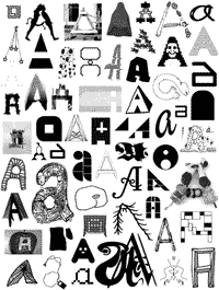
If you’re interested in experimental typography and those works that challenge us re-think the way we see and use lettering, and you haven’t yet seen this exhibit, you’ll surely be interested in “Alphabet: An Exhibition of Hand-Drawn Lettering and Experimental Typography“.

alphabet_ex.gifThe exhibit features the works of 48 designers and artists from North America, Europe, and Asia, ranging from well-known typographers and designers to up-and-coming artists and students. The work they display represents a variety of approaches to letters and a variety of styles ranging from “graceful and polished” to “witty and unconventional.”
Although this exhibit has been touring the United States and internationally for some time now (since July 2005), it continues to make the rounds and impress along the way. Don’t miss a chance to catch it at a city near you (incl. Boston sometime soon?).

Alphabet will be traveling through 2007. Upcoming and past shows include:

  • December 2007 / Ohio Northern University / Ada, OH
  • July 2007 / Say It Loud / Orlando, FL
  • 2007 TBA / Cooper Union / New York, NY
  • Feb-March 2007 / Minneapolis College of Art & Design /Minneapolis, MN
  • January 2007 / Pennsylvania College of Art & Design / Lancaster, PA
  • November 2006 / Northern Illinois University / DeKalb, IL
  • March 2006 / Workhorse Gallery / Los Angeles, CA
  • January-February 2006 / M-80 / Milwaukee, WI
  • November 2005 / Heaven Gallery / Chicago, IL
  • August 2005 / Lump Gallery / Raleigh, NC
  • July 2005 / Pinkard Gallery, Maryland Institute College of Art / Baltimore, MD

Alphabet is curated by Post Typography and organized by Artscape.
For more information on this exhibit, check out the website, or enjoy a sneak peek via the online gallery of selected samples.

Getting past green

As the still-emerging area called “Green Design” builds momentum among graphic designers and other design disciplines, I find myself growing increasingly frustrated. The use of this term, and perhaps even the perceived need to create such a term, implies to me that it is somehow different than good design in general.

Good design is not about incorporating the latest trends or styles, whether it be the hottest new colors or the appearance of “going green”. Mind you, I’m not suggesting that environmentally-responsible design is a fad. In fact, I believe that the need for sustainable design practices began when the earliest messages were put on paper and other non-renewable materials. Unfortunately, this need only gets stronger with time and the ongoing depletion and degradation of resources.

gooddzn.gifI believe that good design is inherently “green”, or at least to the greatest degree possible within any given project. Good design is based on the deliberate and thoughtful consideration of the client, the audience and their experience, and the context in which the project occurs. No consideration of the context can be complete without an examination of the social, cultural and environmental landscape and the impact the project might have. If a designer fails to take these steps, or chooses to ignore these concerns, they are not truly engaging in the practice of good design.

While I applaud the fast-growing popularity of using materials such as FSC-certified papers, I am also witnessing a mindset that suggests that this is all there is to it when it comes to sustainable graphic design. This type of thinking, while obviously better than complete disregard, fosters a process in which these considerations are made only at the later stages of a project, rather than before the first concepts are even developed. By incorporating such concerns into the initial planning stages of a project we can have a much greater and more meaningful influence for positive change.

The use of terms such as “green design”, as if it is a niche or category of design, does little to enable the integration of sustainable practices into the design process. More to the point, I believe it marginalizes the very concerns that it seeks to address. Wouldn’t it be better if we changed the way we approach design to include the concerns of our society, rather the changing the language of design?