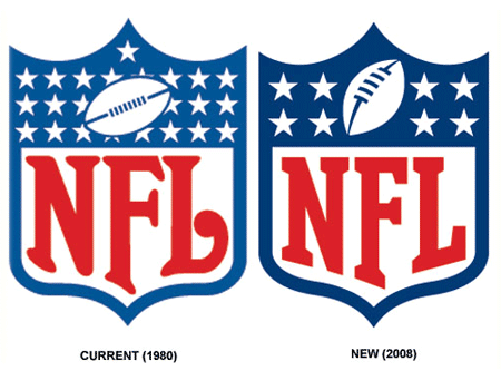
Several weeks ago, sports section of USA Today included a short article previewing the NFL’s soon-to-be-released logo (above). While the new logo, scheduled to debut at the NFL draft in April 2008, clearly (and quite intentionally) does not differ greatly for the current logo, it does include a few carefully chosen modifications:

- Darker colors (red and blue)
- The number of stars has been reduced (from the seemingly random 25 down to 8, to represent the league’s 8 divisions)
- Font is less rounded for a more modern look
- The football has been altered (to more closely resemble the ball atop the Vince Lombardi Championship trophy)
- The overall shape of the shield has been slimmed a bit
With the NFL shield representing one of the country’s most powerful sports brands, the decision to make these changes was surely given careful thought. This careful consideration is evident in the scale and nature of the chosen changes. The revision of the football within the logo to match the championship trophy is likely one of the primary catalysts for this change. It not only unifies some of the leagues most powerful imagery, but disposes of the old, less dynamic football (nicknamed “the hamburger” inside NFL offices).
Updating the logo’s appearance by simplifying it a bit also has clear advantages. the simpler logo will show more clearly in small applications, including smartphones and other new media displays of 2008 and beyond.


Here is something more about new nfl logo
http://www.logoblog.org/wordpress/a-change-in-the-nfl-logo/