The power of one pixel

Going through some older bookmarks, I re-discovered this little gem created by Ben Mautner of Wider Angle:

pop_1pixel

Population One: One Pixel is One Person

While I’m ordinarily not a fan of web pages requiring horizontal scrolling, I found this to be a terrific application for an otherwise frustrating task. In fact, in this case, I found the very act of scrolling (…and scrolling…) to the right to be integral to the delivery of the message. For me, it helped convey the enormity of 6.5 billion – the Earth’s population (current estimate, U.S. Census Bureau).

A simple, yet unique design, providing a powerful and humbling experience…and a reminder to make the most of my pixel.

Typography fun for a cause: Part II

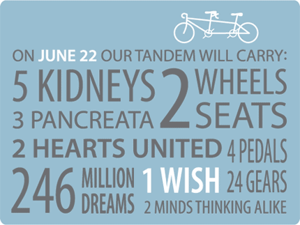
Above:Here’s the front of our fundraising postcard for our participation in this year’s Tour de Cure. (Hey, did you know they typically don’t remove the “old organs” when you receive an organ transplant? And did you know that plural of pancreas is pancreata?)

tdc2008-pc-ft

Background

Since 2000, Lisa and I have been cycling in the American Diabetes Association’s Tour de Cure fund-raising event. We’ve ridden in the MA and NH events, and this year we’re riding in 100 kilometer event in southern Maine for the first time.

We look forward to this annual event because it combines our efforts in the fight against diabetes with our love of cycling (and each other!). Each year, as we humbly request donations to the ADA as part of our participation in the event, we are also reminded of how fortunate we are to have so many supportive and generous friends and family members.

-Rob

Peace button

I recently had the opportunity to design a button for the Sacred Heart Peace Community in Camden, New Jersey — the poorest city in the US, twice declared “America’s Most Dangerous City” (2004, 2005, Morgan Quitno Corp.), and also the city where I was born.

peacebutton_dove

The Sacred Heart Peace Community is a volunteer group that includes my mother. It was formed in 2002 “to stand on the side of life with all the struggling people of Camden and of the world” and to create opportunities for local residents to “participate in resistance to war and all forms of violence.”

Peace to Camden and the world.

– Rob

Looking for anti-war graphics?:
For many more anti-war graphics, created by designers and artists from around the world, check out www.anti-war.us, a site “dedicated to the free distribution of anti-war graphic material”. All designs on the site are “created voluntarily and distributed free to activists around the world.”

Freedom behind bars: bicycling and creativity

Road Cycling Shadow Photo

I have long been drawn to bikes for many reasons; their simplicity, their details, their technology, their geometry, their colors, their practicality, and their seemingly limitless blends of form and function. I love it all. But perhaps the biggest reason is the joy and relaxation I find when pedaling a bike. Over the years I’ve found that riding a bike does as much for the health of my mind as it does for my body. Sometimes, there is nothing quite like a good long ride to clear away the cobwebs, the clutter, the daily stresses, and all the rest that fill my mind and obstruct clear thought.

Perhaps as a result of its clarifying ability, I’ve found exercise, in particular cycling, to be a great catalyst for creative thought. Often, in my work as a graphic designer, when I get stuck in a project, struggling for ideas, strategies, or solutions, a ride on the bike does wonders. It frees my mind. Better still, I’ve noticed positive effects that last throughout the remainder of the day, making me calmer, more even-tempered, and hopefully a bit easier person to live with, compulsions aside.

The idea of a relationship between creativity and exercise is nothing new. Although much of the information on this topic is anectodal, it is also fairly well-supported by scientific literature. In one such recent report, Aerobic Exercise and Creative Potential: Immediate and Residual Effects, written by Dr. David Blanchette, Chair of the Department of Management and Marketing at Rhode Island College, suggests that “aerobic workouts have potential benefits in aiding creativity processes”. The study, using college-age participants, indicated that that “instances of aerobic exercise significantly impacted the creative processes of the participants, and these effects were shown to endure over a two hour period.”

I thought of that while riding my bike.Albert Einstein, on the Theory of Relativity

The ability to utilize the creativity-boosting benefits of exercise to one’s advantage may be something that can be learned, or least improved with practice. Perhaps, at a minimum, one must be open to the idea, allowing themselves to be receptive to the notion that exercise may indeed affect their thinking. This concept of an individual’s receptivity and mood prior to exercise and it’s role in that exercise’s ability to improve creativity was explored in a 1997 study by the British Journal of Sports Medicine, Exercise enhances creativity independently of mood, (Steinberg, Sykes, Moss, Lowery, LeBoutillier and Dewey). As the report’s title suggests, its results indicated “that mood and creativity were improved by physical exercise independently of each other.”

Have you noticed a link between your exercise patterns and your creative thinking skills?

Emerging logo design trends for 2008

It’s hard to believe it’s been a year already since I wrote about their last report (Logo design trends for 2007), but LogoLounge has again released their thought-provoking, mid-year report on trends in logo design. The report, written by Bill Gardner and published in the April issue of GD USA magazine, can be viewed in its entirety at gdusa.com.

The title, LogoLounge.com THE 2008 REPORT: MORE CLEAN and Less Green, reveals at least two of the “prevailing winds” identified at the start of this year’s report, working to shape the 15 trends identified within. “We saw less emphasis on sustainability or general “greenness” in logo design. There’s plenty of natural imagery but being “green” doesn’t seem all that unique anymore.”, Gardner writes. He also observes, “There’s an overall move toward cleanliness — in type, in line, in color — as if ideas are getting more and more succinct. It may be an indication of the degree of seriousness with which branding is now regarded.” Also speaking to the rise in simplicity within today’s designs, Gardner writes, “Less is more common: less calligraphy, less Photoshop tricks, less artificial highlights.”

Could these “winds” represent a societal backlash against the current trendiness of touting one’s “greenness”? Are we pushing back or pushing forward? Or, are we just getting past green? Similarly, could the desire for simplicity in design be an expression of our desire for simplicity in other parts of our complicated world? Or, are designers not an accurate mirror of the societies in which they work, making these question ill-conceived?

Regardless of the answers to the questions I’ve posed above, or of any outside influences that might be driving a move toward simplicity and away from the oft-overused software-generated effects, I, for one, am pleased to see it.

Deep questions aside for the moment, let’s get back to the matter at hand. Gardner identifies 15 trends within his report. He gives each of these trends a brief moniker, with some requiring a bit more explanation than others. For these explanations, the context, and the all-important visual examples of logos within each trend, I recommend reading the full report. Nevertheless, here they are in nitty-gritty list form:

  1. Supernova
  2. Fine Line
  3. FoldOver
  4. Global Expansion
  5. Loops
  6. Jawbreakers
  7. Strobe
  8. Nimbus
  9. Stitch
  10. Colorblind
  11. Amoeba
  12. Facets
  13. Doodles
  14. Flourish
  15. Fibrous