Page layout and Google ranking

Post Banner Image

If you’ve ever visited a website only to be frustrated by having to scroll through a slew of graphics, flash, ads or other stuff in order to get to the content you were after, Google feels your pain…and has recently revised its ranking algorithm accordingly.

Google’s algorithm will now look at the layout of a webpage and the amount of content visitors see “above the fold” upon first arrival at the page. That information will now be factored into the ranking of search results. [continue reading]

NECC Anniversary Banners

Post Banner Image

Sproutreach recently had the pleasure of designing a series of banners celebrating the 50th Anniversary of Northern Essex Community College. The banners are displayed at various outdoor and indoor locations throughout the college’s Haverhill Campus, and were designed to complement the campus existing signage. [continue reading]

Inspiration from utility covers

Post Banner Photo

Inspiration often comes from unexpected places. During a recent visit to Ireland, while walking through Kinvara, a small seaside village approx 15 miles south of Galway City, I noticed this utility cover in the sidewalk. Marked with “uisce” (water) and “WSCR” (water service control box), these wonderfully detailed access covers can be seen throughout much of the country. Beyond the lovely design and patterning, they convey a pride in workmanship and an attention to detail that I find inspiring. [continue reading]

Learning from stamps

It’s no secret that the word “green,” and even more so the phrase “go green,” have entered the ranks of cringe-worthy marketing cliches, as they continue to suffer widespread abuse at the hands of countless disingenuous advertising slogans designed to cash in our desire to be good environmental citizens. So, admittedly, it was with a dose of skepticism that I learned of the USPS’ “Go Green” stamps, first released a few weeks ago. However, after picking up a set at my local post office, I was immediately drawn to the wonderful illustrations and the simple messages contained in each stamp.

Go Green Stamps

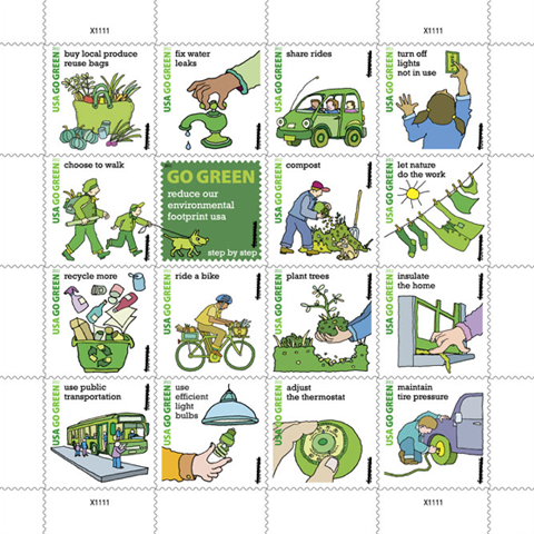
It’s perhaps the simplicity of those messages, coupled with the backlash to things dubbed “go green,” that has brought about some criticism of the stamps, including this rather snarky review posted by Fast Company. However, in my opinion, these stamps are right on the mark, largely BECAUSE of the simplistic messages this type of criticism points to. The stamps’ messages speak to the laziest of us, saying “These are thing you can do easily. Just try these simple changes in your daily habits and you’ll be making a difference in some small way.” Refreshingly, there are no messages for you to buy something, except for maybe local produce, as one stamp urges. [continue reading]

Kurt Weidemann’s legacy

Kurt Weidemann – typographer, graphic designer, brand identity consultant, and teacher – passed away one week ago at age 88. Widely accepted as one of the most influential typographers of the 20th century, he leaves behind an indelible mark on the industry, as well as printed communications in general. Yet, perhaps the greatest lesson to be taken from his life is in the manner in which he conducted business – with the courage and conviction to follow his strong morals and ethics. [continue reading]